Case Study: Valor Properties’ Website Design
At H&A Marketing, we work with a lot of construction and contractor clients. Valor Properties was no different — until they gave us a new kind of challenge.
We’ve worked with the owners of Valor for several years now. From logo design to marketing assets for other ventures, they’ve trusted us to help bring their ideas to life with clarity and purpose.
So when they came to us about their cabin rental business in Fort Payne, Alabama, they came not just for a website, but for a brand experience that would do justice to the place they were building.
But this time, we weren’t branding a construction company or building a portfolio-style site.
We were helping them tell a much different story — one built around peace, rest, and the kind of quiet that’s hard to find in today’s busy world.
And the website needed to reflect all of that — from the way it looked, to the way it felt, to the way it worked.
The Challenge: Make It Feel Like a Retreat
Valor Properties didn’t just want a listing-style website. This wasn’t about showing square footage and nightly rates.
This was about creating an emotional response.
Their cabins are tucked into the hills of Fort Payne — a town that’s known for its scenic beauty, starry skies, and slower pace of life. The goal was to give guests a reason to unplug, unwind, and actually book that getaway they’ve been thinking about for months.
So the site had to capture that feeling — from the first glance to the final click.
We had a few key objectives:
Create a visual and written experience that slows people down
Showcase the cabins and scenery in a way that feels warm and authentic
Make booking seamless, fast, and mobile-friendly
Encourage direct bookings (instead of losing revenue to third-party platforms)
Build trust with guests who are new to the area and looking for a reliable, beautiful stay
And underneath it all — the site needed to feel like the cabins themselves. Calm. Simple. Intentional.
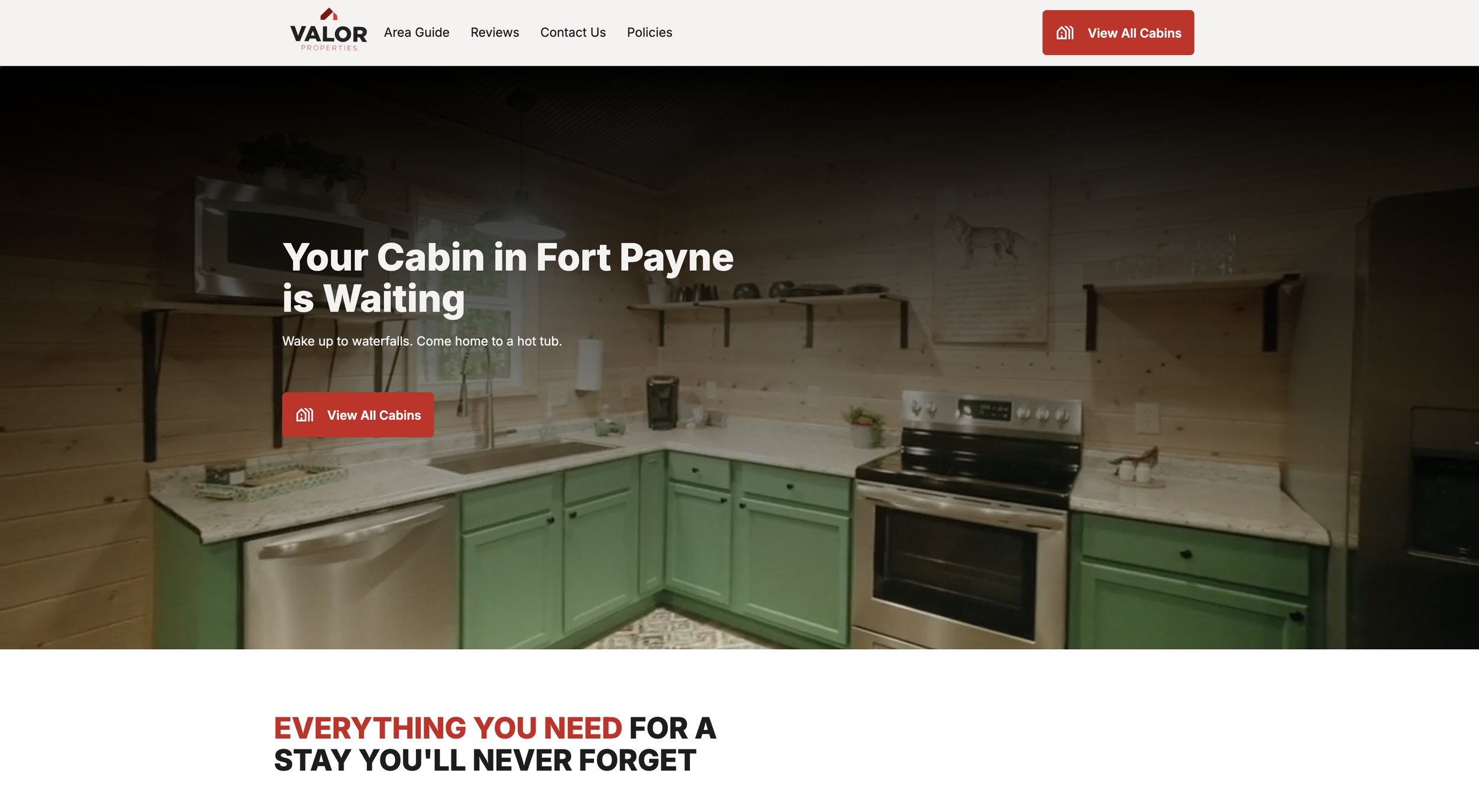
A Website That Breathes
When we started wireframing and planning the design, one idea came up again and again: space.
We didn’t want the site to feel crowded or rushed. We wanted it to breathe. To have white space. To give the images room to shine. And to help the visitor feel a little bit of what they’d feel when stepping onto the cabin deck in real life.
We kept the layout clean and intuitive. No gimmicks or distractions. Every section had a purpose — either to show the beauty of the space, explain the experience, or guide someone toward booking.
On the homepage, we lead with a powerful visual and a simple message. As you scroll, you’re introduced to the cabins, the booking process, and the values behind the brand. The experience is seamless and welcoming — just like the getaway itself.
On mobile, the site still feels smooth and thoughtful. Since most travelers browse and book from their phones, we made sure the mobile UX was quick, clean, and free of friction.
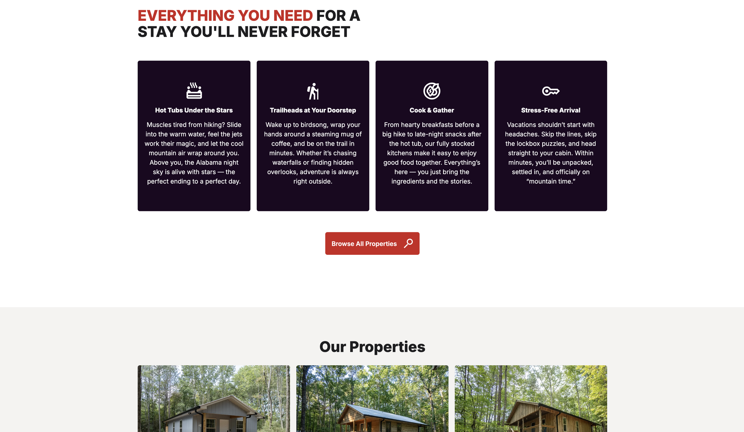
Key Features Built to Perform
This wasn’t just about pretty design. It was about smart, strategic function. We made sure the site had everything Valor Properties needed to support growth and create trust with future guests.
Some of the key features include:
Direct booking integration with real-time calendar availability, built into each cabin page
Responsive mobile design so guests can explore and book on any device
Visual storytelling through full-width photography that showcases the actual views, interiors, and peaceful atmosphere
Clear calls to action that guide users toward booking without pressure or confusion
Fast page load speeds to improve both SEO and guest experience
Simple navigation so users can get from homepage to confirmation in just a few clicks
The site was built to grow with them. As they add more cabins or expand into other short-term rental offerings, the design system and backend are flexible enough to support that growth — without needing to start over.
Messaging That Invites, Not Sells
We took a very intentional approach to the website copy.
While most rental sites are packed with facts and features, we chose to lead with feeling.
We asked ourselves: What is someone really looking for when they search for a cabin rental?
They might say they’re looking for a hot tub or a cozy bed. But what they’re really looking for is rest. Clarity. A reason to step away for a few days and just breathe.
So the copy reflects that.
Instead of technical descriptions, we used warm, story-based language:
“Slow down and reconnect”
“The perfect ending to a perfect day”
“Let the stillness of the mountains lull you into rest”
The tone is friendly and clear. No fluff or sales jargon. Just a calm, trustworthy voice that matches the experience they’re selling.
This approach helps build trust — and helps visitors imagine themselves there, which is often what leads to the booking.
A Site That’s Built to Convert
While emotion was key, we didn’t forget about performance.
The site was carefully optimized to help users book easily, and to help Valor keep as many of those bookings as possible in-house, without losing fees to third-party listing sites.
Each cabin page features:
Large visuals
Key amenities
Real-time calendar with availability
Seamless checkout process
The result is a booking experience that’s just as peaceful as the stay itself.
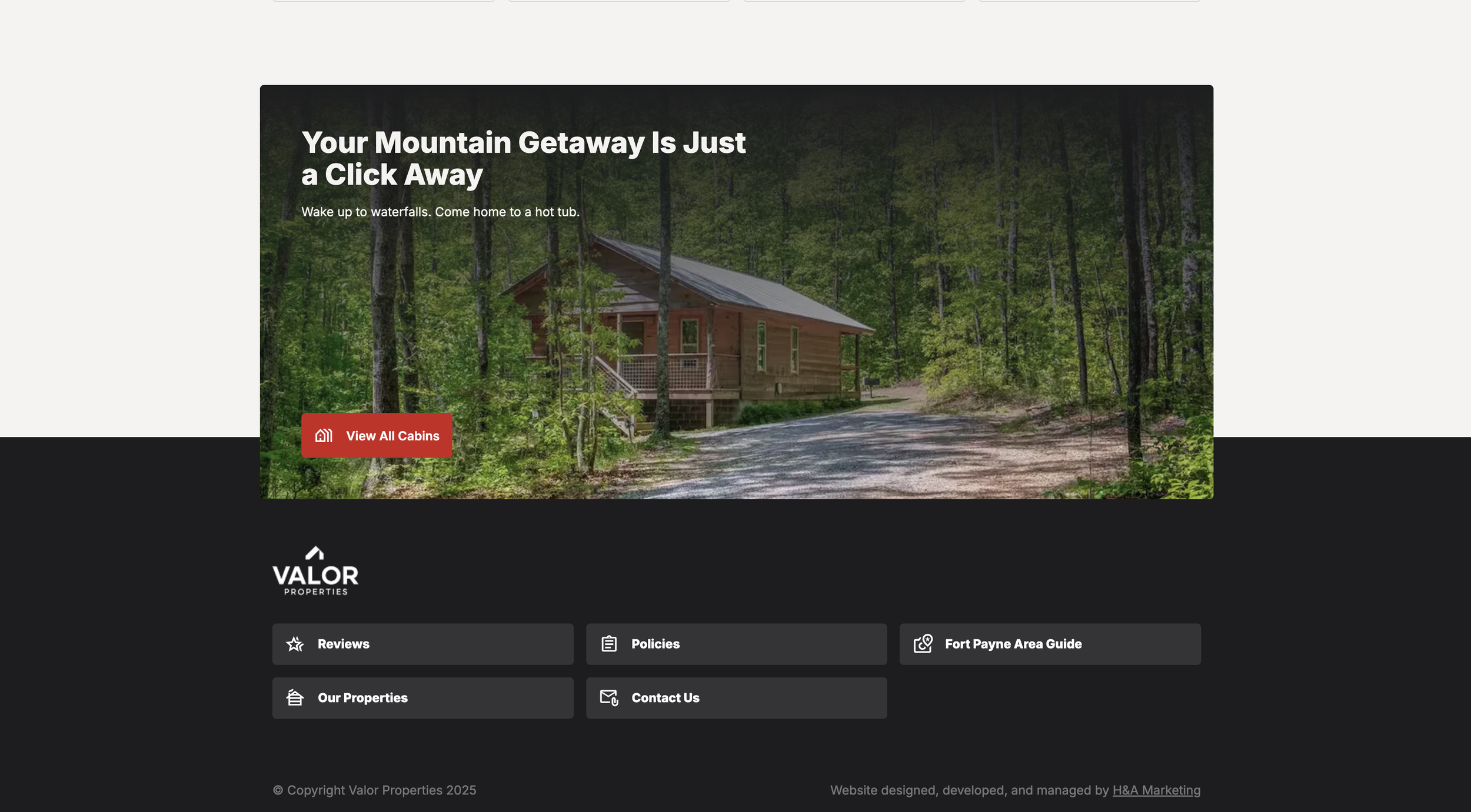
Designed to Support the Brand
A year before this website launch, we worked with the Valor team to design their brand identity. The logo — a strong, clean mark — reflects the company’s values of strength, trust, and clarity.
That visual foundation carried over into the new site. The colors, typography, and design all stem from the brand we built together, helping create a seamless, professional experience from start to finish.
Guests may not think in terms of brand systems, but they feel the difference when every detail works together. It builds credibility. It builds confidence. And it makes guests more likely to book and recommend the cabins to others.
A Trust-Based Partnership
This project also reflects something we’re proud of at H&A: long-term relationships.
Valor isn’t just a one-time client. They’re part of the group of construction and property owners who’ve come back to us again and again — because they know we understand their business, their audience, and how to make their ideas feel real.
When a client trusts us enough to bring us back for a completely different kind of project, it says a lot about the relationship we’ve built. And in the case of Valor, we were honored to help expand their brand in a new direction — while keeping everything aligned with who they are.
The Final Product
You can explore the full site here: www.valorpropertiesgroup.com
Whether someone visits on a laptop, tablet, or phone, the site is designed to feel just like the getaway itself: quiet, welcoming, and easy to say yes to.
Final Thoughts
At H&A, we believe websites should do more than “look good.” They should tell a story. Create a mood. And help people take action.
In the case of Valor Properties, we built more than a booking site. We built a calm, trustworthy experience that reflects the peaceful mountain stays waiting in Fort Payne.
If your business sells more than just a product or service — if it sells a feeling — then you need a website that captures that emotion.
Let’s build something that makes your customers want to pack a bag.