
Construction Company Logo Design: Branding That Wins Trust and Bids

Article by
Harry Stanley III
Harry Stanley III is a construction marketing strategist and fractional CMO at H&A Marketing. He has helped construction companies grow through website strategy, SEO, paid advertising, branding, lead generation, CRM systems, and professional content. His past work includes helping Meraki Solar generate an additional $3.7 million in revenue in his first year and supporting American Builders as a fractional CMO. Today, Harry works directly with custom home builders and construction companies to build marketing systems designed to generate qualified leads and measurable growth.
A construction company logo that looks sharp on a website can still fail on a truck door. If the lettering blurs at a distance or the symbol feels like every other contractor’s, it won’t do much to build confidence when clients see it on a job site, proposal, or work vehicle.
Choosing a direction can be tricky. You want the construction company logo to reflect the work you do and the clients you serve, without becoming generic or difficult to use at small sizes. The strongest option isn’t necessarily the most detailed. It’s the one that feels credible and stays clear wherever your company shows up.
This guide breaks down practical logo styles, typography, color, and symbols for construction businesses. You’ll also learn how to judge concepts against real applications, from vehicle graphics and job-site signs to proposals and digital channels. A logo works harder when it fits a consistent brand, so we’ll show how it can connect with your website, marketing, and project photography too.
Key Takeaways
- Compare wordmark, monogram, symbol-led, and combination-mark directions to find a fit for your company’s work and audience.
- Judge a construction company logo at both screen size and real-world scale, including on vehicles and job-site signage.
- Review concepts for legibility, contrast, spacing, and consistency before approving a final design.
- Use practical mockups to see whether a logo stays recognizable across proposals, websites, and other marketing materials.
- Connect your visual identity with your website, search, advertising, and lead capture as part of a coordinated marketing system.
Construction Company Logo Examples: What Strong Builder Brands Signal
Your logo has two jobs: identify your construction business and give the right clients a credible first impression. A mark designed for custom homes may need to feel considered and detail-focused, while one aimed at commercial projects may call for a more direct, established presence. The right visual direction depends on the work you want to be known for, not just the tools or buildings associated with construction.
A construction company logo is a visual identifier, usually made from a name, symbol, or both. It’s one part of a larger brand system that shapes how your company presents itself across proposals, signs, vehicles, and digital channels. The broader idea of corporate identity helps explain why a logo should work alongside other consistent visual choices, rather than carry the whole brand on its own.
What a construction logo needs to communicate
Typography, symbols, and color each set a different tone. Clean, well-spaced lettering can suggest precision. A simple, stable shape may feel dependable. A restrained line detail can hint at craft or architectural thinking. These are design cues, not promises of quality, so connect them to your actual work and audience.
For example, a custom home builder courting clients who value design may favor a refined typeface and a subtle structural reference. A contractor pursuing commercial work may choose heavier lettering and a straightforward mark that reads clearly on bid documents. Avoid defaulting to hard hats, hammers, or roof outlines unless the specific treatment says something distinctive about your company. A logo can support trust, but it can’t guarantee leads, bids, or sales.
Conceptual construction logo examples by design direction
The following are illustrative concepts only. They are not H&A client projects, portfolio examples, or claims about real companies.
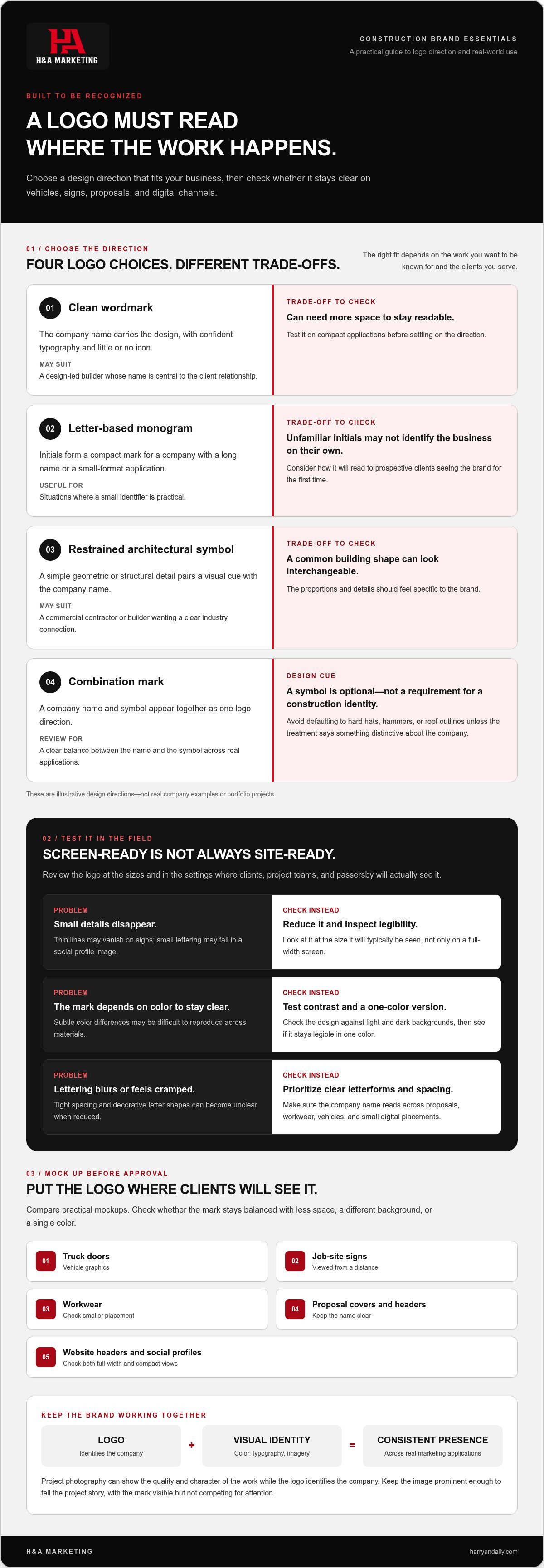
- Clean wordmark: The company name carries the design, with confident typography and little or no icon. It can suit a design-led builder whose name is central to the client relationship. The trade-off: without a symbol, it may need more space to stay readable on compact applications.
- Letter-based monogram: Initials form a compact mark, useful for a company with a long name or for applications where a small identifier is practical. The trade-off: unfamiliar initials may not identify the business on their own, especially to prospective clients seeing the brand for the first time.
- Restrained architectural symbol: A simple geometric or structural detail pairs a visual cue with the company name. It may fit a commercial contractor or builder wanting a clear industry connection. The trade-off: a common building shape can look interchangeable unless its proportions and details feel specific to the brand.
H&A Marketing develops construction-focused logo design and branding around a company’s positioning and practical marketing needs.
How Construction Logo Design Choices Work Across Real Applications
A logo can look crisp on a large presentation slide and still lose its detail on a proposal header or a moving truck. Review it at the sizes and in the settings where clients, project teams, and passersby will actually see it. Small changes to letter spacing, contrast, or detail can make the difference between a mark that reads quickly and one that turns into visual clutter.
Typography, symbols, and color in a builder logo
Clear letterforms matter because your company name needs to be recognized on proposals, workwear, vehicle graphics, and small digital placements. Avoid tight spacing or decorative letter shapes that blur when reduced. A symbol can help identify the business, but it’s optional. A roofline, tool, or building silhouette isn’t required to make the mark feel connected to construction.
Check contrast against both light and dark backgrounds, then review a one-color version. If the design depends on subtle color differences to stay legible, it may be difficult to reproduce across different materials. The American Marketing Association’s overview of branding provides useful context: a logo is one part of how a business presents its identity, not the whole identity itself.
Where a construction company logo has to work
Check the design in realistic settings, not only on a polished slide. Include:
- Truck doors and other vehicle graphics
- Job-site signs
- Workwear
- Proposal covers and headers
- Website headers and social profiles
Look at each application from the distance and at the size it will typically be seen. A thin line that looks elegant on a monitor may disappear on a sign. Small lettering may be clear in a full-width website header but unreadable in a social profile image. Ask whether the mark still feels balanced when it has less space, a different background, or a single color.
Your visual identity includes more than the logo. It also covers how color, typography, and imagery work together. Project photography can show the quality and character of your work while the logo identifies the company. Keep the image prominent enough to tell the project story, with the mark visible but not competing for attention. See how professional photo and video can support construction marketing alongside a consistent visual identity.
Before approving a direction, compare mockups on a vehicle, a job-site sign, a proposal, and a website header. H&A can help connect logo choices with construction branding across real marketing applications.
Which Construction Company Logo Direction Fits Your Business?
The best construction company logo format depends on who needs to recognize your business, what work you want to be known for, and where the identity will appear. A company name that’s short and distinctive may work well as a wordmark. A long name or a need for a compact identifier may point toward a monogram or symbol. No format is automatically right for every builder.
Wordmark, monogram, or symbol: what changes?
A wordmark makes the company name the main feature. A monogram uses one or more initials as the mark. A symbol-led design puts an icon first, while a combination mark pairs a symbol with the name. Compare the trade-offs against your likely applications:
| Direction | Readability | Distinctiveness | Versatility | Possible fit |
|---|---|---|---|---|
| Wordmark | Clear when the name is legible | Depends on the typography and name | Works well where there’s room for the full name | Builders whose company name is central to recognition |
| Monogram | May need familiarity before initials are recognized | Can stand apart if the letterforms feel specific | Compact for smaller placements | Companies with longer names or a need for a concise mark |
| Symbol-led | Can be quick to recognize once associated with the business | Depends on how original and relevant the symbol feels | Useful where a compact graphic is needed | Established brands or businesses building recognition around a visual mark |
| Combination mark | Pairs the name with a visual cue | Offers room for a more tailored design | Can require a simplified version for tight spaces | Builders who want the name and symbol to work together |
Use your business name and real applications to narrow the first round. If the full name needs to read on a proposal and a vehicle, prioritize a format that keeps the lettering clear. If a compact mark matters for workwear or a social profile, consider whether initials or a symbol can remain recognizable at a smaller size.
How to avoid a generic builder logo
A roofline, hard hat, tool, or building silhouette can be relevant, but adding construction imagery doesn’t automatically make a logo distinctive. Treat familiar symbols as options to assess, not elements you must use or avoid. Ask whether the visual connects to your company’s actual work, the clients you want to reach, and your position in the market. A premium custom builder and a commercial contractor may need to signal different strengths.
Discuss your construction brand direction with H&A’s construction branding team to connect the logo concept with your audience and practical uses.
How to Review a Construction Company Logo Before Approving It
Don’t approve a logo based on a single polished presentation. Review the design against your audience, your company’s positioning, and the places it needs to appear. A construction company logo should stay recognizable on a proposal and a truck, not just look appealing at full size on a screen.
A practical logo review checklist for builders
Work through these checks in order. Keep feedback tied to business needs, not just personal taste. “The name is hard to read on a truck door” points to a specific issue. “I don’t like that shape” may reflect preference unless the shape sends the wrong message to your clients.
- Check audience fit. Does the visual direction suit the clients and projects you want to attract, such as custom homes or commercial work?
- Read the company name at different sizes. Review it large and small. Look for letterforms that blur, crowd together, or become difficult to distinguish.
- Review color and contrast. Check the full-color design on light and dark backgrounds, then inspect a one-color version. The name and key shapes should remain clear.
- Test realistic mockups. View the logo on a truck, workwear, a proposal cover, and a website header. Check whether the proportions and spacing still work in each setting.
- Confirm consistency and handoff. Make sure the approved versions, colors, and spacing guidance are clear so the logo can be used consistently across materials.
For the website test, place the logo in the header alongside the navigation and page content. Check whether it feels clear without crowding the layout. H&A’s construction web design connects the identity to a practical website experience.
Prepare the logo for consistent use
A useful handoff should make clear which logo versions are approved, how much space to leave around the mark, and which color treatments to use. That guidance helps keep the identity consistent when different people prepare proposals, signs, or digital materials.
Ask for files suited to the intended uses, such as print, signage, and web. The right formats depend on how the logo will be produced, so the handoff should identify which file goes with each application rather than leaving your team to guess.
Turn a Construction Company Logo Into a Consistent Marketing System
A logo becomes more useful when it appears as part of a consistent experience. A prospect might first see your company in a search result or paid ad, then visit your website, review project photos, and compare your proposal with others. Consistent use of your logo, colors, and typography helps those touchpoints feel connected. It doesn’t guarantee rankings, leads, or contract wins, but it can make your business easier to recognize and your presentation clearer.
Connect the logo to the homeowner and project journey
For custom home builders, visual consistency supports premium positioning. A polished website, strong project imagery, and a proposal that feels like it belongs to the same company help homeowners understand the quality and character of your work as they consider a major project.
For commercial construction companies, consistent identity helps keep project credentials, sales materials, and digital presence aligned. A prospective client should be able to recognize the same business across a search result, your website, a capabilities presentation, and a bid document. The construction company logo anchors that recognition, while the project details and proof of experience do the work of showing what your team can deliver.
What to do next with your construction brand
Start by applying the approved logo consistently, then align the supporting pieces around it. Check that your website, search presence, paid campaigns, lead capture, sales materials, and project imagery use a coherent visual approach. The logo identifies your company; clear service information and relevant project content help potential clients assess fit.
H&A Marketing treats construction branding as part of a connected marketing system, coordinating strategy, creative, traffic, and lead capture rather than presenting a logo as a standalone growth solution. That gives your identity a practical role across the channels where prospective clients encounter your business.
Discuss your construction marketing strategy with H&A and explore construction branding services.
Put Your Construction Brand to Work
A strong construction company logo should fit your audience and communicate clearly wherever clients encounter it. Choose a direction based on your company’s work, then review it on real applications, from proposals and vehicles to your website. The right design isn’t simply the one that looks best on a screen; it’s the one your team can use consistently.
H&A Marketing provides construction-focused logo design and branding as part of a connected marketing system. That system can coordinate your brand with website design, SEO, paid traffic, CRM tracking, and professional visual content. The logo supports recognition, while each marketing channel helps present your work and guide prospects through the decision process.
With a clear identity and consistent use across your marketing, you’ll be better prepared to present your company with confidence at every stage of the next project conversation.
Frequently Asked Questions
What makes a good construction company logo?
A good construction company logo identifies the business clearly and fits the clients and projects it wants to attract. Choose typography and visual elements that reflect your positioning, then check that the name remains readable at different sizes. The design should also work across practical uses, from proposal covers and website headers to vehicle graphics. A logo supports a credible, consistent presentation, but it can’t replace clear project information or strong work.
Should a construction company logo include a house, roof, or tool?
No, construction imagery is optional. A house, roofline, or tool can connect a logo to the industry, but familiar symbols can also make a design feel interchangeable if they aren’t treated in a distinctive way. Start with what your business does and who it serves. A custom home builder may use a subtle architectural reference, while a commercial contractor may prefer a strong wordmark that keeps attention on the company name.
What colors work best for a construction company logo?
There’s no single best color palette for every builder. Choose colors that suit your audience and brand position, then check that the name and symbol remain clear against light and dark backgrounds. For example, a restrained palette may support a refined custom-home presentation, while a bolder combination may feel appropriate for a company seeking a more direct, high-visibility look. Test the design in one color too, so it doesn’t depend on color alone.
How do I know if a construction logo will look good on trucks and workwear?
Review realistic mockups before approving the design. Check the logo on a truck door, a work shirt, a proposal cover, and a website header. View it at the size and distance people will encounter it. Look for small text that becomes hard to read, thin details that disappear, or low contrast against the background. A mark that works only when enlarged on a screen may need simpler shapes or adjusted spacing.
Should I use a logo template or create a custom construction company logo?
A template can provide a quick starting point, but it may limit how specifically the identity reflects your company’s work and positioning. A custom construction company logo can be developed around your business name, target clients, and practical applications, rather than adapting a preset layout. Either way, judge the result by readability, distinctiveness, and how well it works across your marketing materials, not by how many construction symbols it includes.
What files should I get with a construction company logo?
Ask for a scalable master file for uses such as signage and print, along with web-ready versions for your website and digital materials. A transparent-background image can be useful when placing the mark over different backgrounds. The handoff should also identify approved color and one-color versions, plus guidance on spacing and background use. Confirm which files suit each application so your team can use the logo consistently instead of guessing.
Can a new construction company logo help generate more leads?
A logo alone can’t guarantee more leads, bids, or sales. It can help your business present itself consistently and make it easier for prospects to recognize your company across search results, ads, your website, and sales materials. Lead generation also depends on factors such as relevant project information, clear next steps, and coordinated marketing. Treat the logo as one part of that system, not a standalone solution for filling your pipeline.
